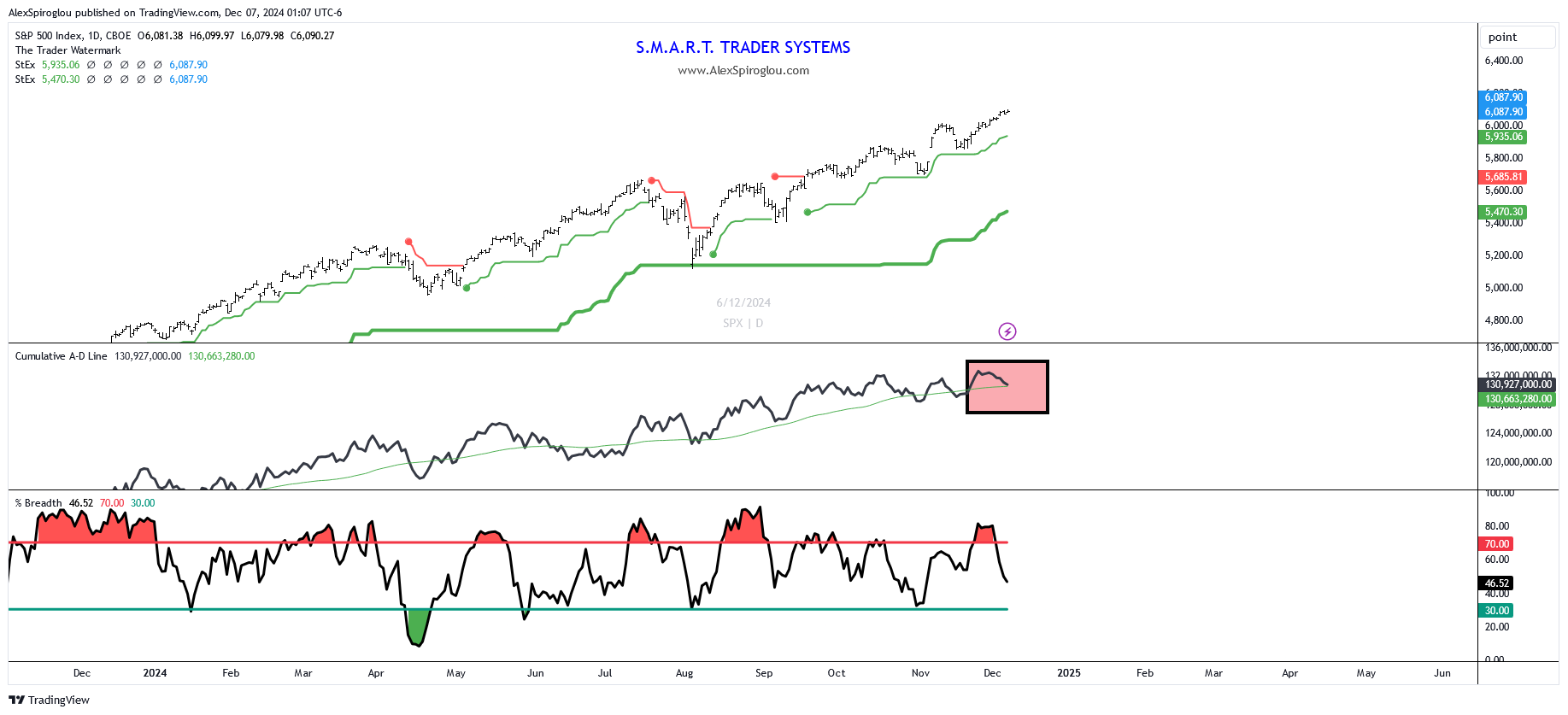
TOP PANEL: SPX & Volatility Stops
BOTTOM PANEL: % of SPX stocks > 20 MA , NYSE A/D line
Section 1: The market has bad brea(d)th
When it comes to the market’s foundation, things aren’t looking as strong as they seem.
The middle panel of the chart highlights the cumulative NYSE A/D line,
which tracks the net number of advancing vs. declining stocks on the NYSE.
Right now, it’s flashing a warning: despite the index hitting new highs,
the A/D line isn’t confirming this move (highlighted in red).
In the third panel, the percentage of SPX stocks trading above their 20-day EMA
(short term breadth) is also slightly concerning.
It recently hit overbought levels (>70) but is now declining,
another warning for the market’s strength.
Section 2: About the Indicators
- NYSE A/D Line: This measures market breadth by comparing advancing stocks to declining stocks. A rising line confirms broad participation, while a divergence signals fewer stocks driving the rally.
- % of SPX Stocks > 20 EMA: This indicator shows the percentage of SPX stocks trading above their 20-day exponential moving average. Readings above 70% suggest overbought conditions, while a decline signals weakening momentum.
This article was originally published by Fxstreet.com. Read the original article here.

